Speak Your Mind
Packaging design for Peruvian Chocolatier, Death by Xoko.


Speak Your Mind
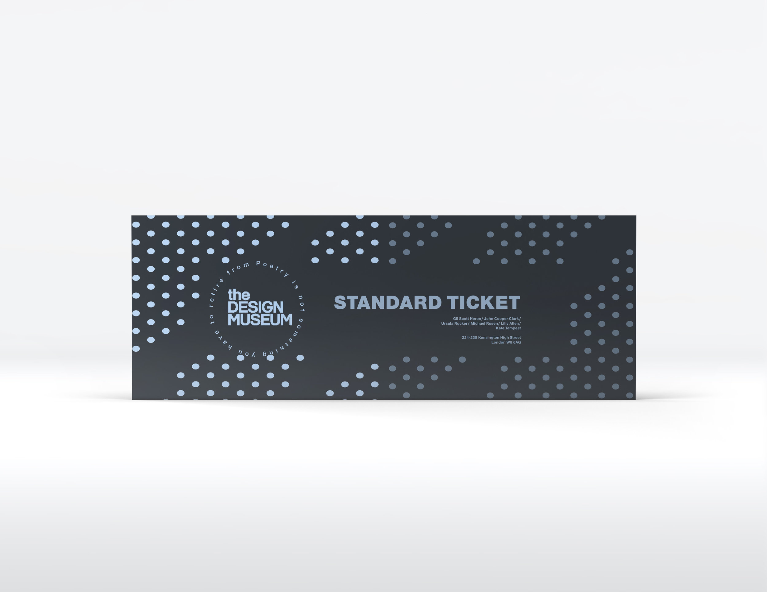
Speak your mind is an exhibition dedicated to the event of world book day, celebrating through the creative mind and literal genius that is John Cooper Clark. Celebrating through a series of advertisements that captures his visual personification of the most thought provoking and creative writers of his generation, this is emphasised through the corporate visual imagery of advertisements such as posters, moving billboards and event day tickets all created to serve the world book day at the design museum in London.
Furthermore I hoped to achieve by the end of this project, A clearer more corporate way of understanding this historical figure though there medium of just typographical layouts, this became especially helpful when incorporating the full stop dot which is critical element to literacy, which became the overall figure head wen creating these designs for the corporate event. Evidently seen on the posters and ticket event which is carefully crafted and presented with type though the middle and the dotted pattern in the backdrop creating depth and charter which is nicely fitted into its overall narrative with Cooper Clarke persona of being all those elements with a nice contrast of blue and navy which later though the project was personal choice.
Another critical element that brings all these visual eco system together cleanly and consistency is though the impotence of world book day which again is evidently shown through Cooper Clarke work as a poem being nicely represented though these book page covers and contents that selects and presents some of his finest work though the sleeted of typography. All great artists such be presented honestly and reflective of their work and this is perfectly depicted with the visual style and identity created though this piece, everything is chosen personally and all have a consist identity created through the brand, the event is corporate but also personal with a hint of structure. Every element such as the full stop as being previously discussed acts with purpose and movement with the motion piece being the catalyst with each dot forming the literal structure of “the design museum” which is where the event was held, overall this project was created to make a compelling and realistic attempt of a brand event that celebrates its chosen subject though the medium of typographical layouts and understanding its significant depicted with its audience. It may be one of the earliest projects to date but it’s possible one of the most important as it shifted my attention to design thought the importance of personal reflecting of branding and identity which is something, I hope to pursue properly later down my career.
Corporate sets and stationary is something that is clearly overlooked by other designers but for myself becomes just as important and the initial message itself, how do you get audience to remember an idea though the ways of being clear and subtle, the very pencil they are using in person to jot down a memory or doodle these opportunities are a great way by carrying the message over and being pragmatic and less forceful on the user, that’s the aims I tried to attempt when designing the whole corporate campaign. The brand guidelines are the most critical element by presenting my ideas that have a clear understanding and identity of representing the world book day event for the enjoyment of the audience and Claire crated though the visual messaging that’s the sort of power this particular field of design is capable of doing without being so forceful and obis to its audience it is so desperately trying in an attempt to do.
Overall the theme is was an attempt to create a brand guideline that celebrates its chosen artist though the mean of purely typographical depiction, while remaining maudlin and stylish with an overall clear message that reflects its core identities and visual layouts, for my brand campaign using world book day the literal element of the full stop addresses these ideas though the satire ideologies used and colouring created an clean and consistent brand for its overall purpose.